

A global archive of independent reviews of everything happening from the beginning of the millennium
![]()
![]()
![]()
![]()
![]()
![]()
![]()
![]()
![]()
![]()
![]()
![]()
![]()
![]()
![]()
![]()
![]()
![]()
For publication dates click here
Read our Copyright Notice click here
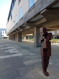 Pixelation of real art?
 I should prefer real art even though pixellation can
be used for visualisation.
I should prefer real art even though pixellation can
be used for visualisation.
 Skimming clouds can cast ghostly shadows through your
windows. Art and imagination are
anchored in the real - will the avatar world be?
Skimming clouds can cast ghostly shadows through your
windows. Art and imagination are
anchored in the real - will the avatar world be?

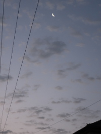
 All the colours -
even of moonlight
All the colours -
even of moonlight
It is hard to imagine what monochromatic music would be like - only hearable by computers and so mediated by avatars?
In the suite of vision systems that can be used for driverless cars there is 'seeing' that can only be done by computers.
The infrared spectrum is a simple case. If you stand behind the sculpture you will be masked for infrared but a driver is considering context and looking for you and even changes in colour in a shadow may alert him.
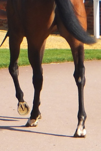 A ray tracing programme would not generate this
image but the eye knows this is not a three-legged horse
A ray tracing programme would not generate this
image but the eye knows this is not a three-legged horse
There is sound outside of the auditory range but monochromatic music would likely be within the range.
There is colour in human music, though. When the avatar 'translates' the monochrome for you, have you trained your ears to know colour?
 This is the antithesis of monochromatic - no computer
could create it
This is the antithesis of monochromatic - no computer
could create it
TECH TOO GREY
Reviewed by ANDRE BEAUMONT
The metaverse will create digital avatars in digital space.
This will monetise everybody?
Wear a headset?
Who is kidding who?
The recent expensively created Abbatars will be more like the childhood experience of going to the planetarium, certainly better than the purely digital, where light representations were cast on a dome.
For Abbatars, a physical space receives elaborately created, performing avatars.
You might not see the boundaries.
The music is a digital representation of the real - recorded music.
I would be able to tell the difference from real performers' acoustic contribution. I do not try to get a seat near the front for no reason when there is a mixture of acoustic sound and amplified sound at a concert.
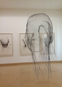
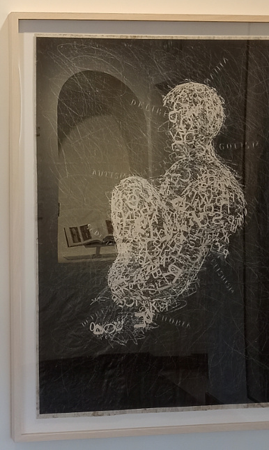
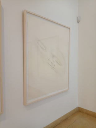
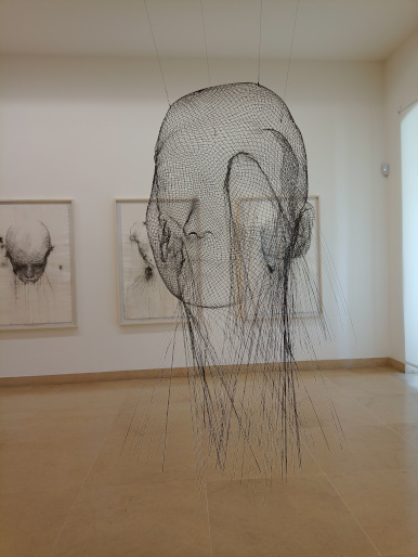
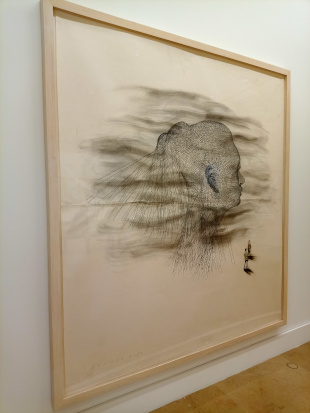
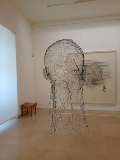
Jaume Plensa is an interesting artist.
Jaume Plensa - La Lumière Veille exhibition - Picasso Museum, Antibes
But the boundaries are in the world of the real not the digital.
The greys are not deliberate. Interior design uses them far too much and a colour-profiled mobile phone cannot cope with the reflected colour casts. Neither the walls nor the exhibits are grey but if galleries do not use some more bolder colours in the exhibition spaces the reflections and colour casts can be. White can be neutral but grey is not. Mediterranean midday light has a high colour temperature. As it is best to keep direct rays of sunlight off them, exhibits are in shadow and this tends to create a grey cast, though the works can appear acceptable enough to the human eye.
The phone is not coping but maybe the answer is not to accept a digital representation and see the real thing.
I should not be in favour at all of moving to wholly artificially lit spaces. No fun at all - like a home that has to remain at constant temperature for the heating to work; leave that to commercial premises.
Better elsewhere in the exhibition but now too warm. The four year old phone, that was preferred till recently because it takes better pictures with no time delay to manipulate it, would have breezed it compared with the newer one.
Can we have not too much preset colour profile in tech products?
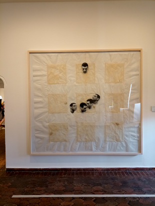
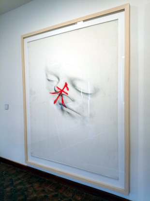
The lighting problem can be discerned here. The direction of this review was to be how subtle Jaume Plensa is as an artist. This work, entitled Monochrome I, is happily not monochrome at all but an interesting early exercise in adjacencies of colour allied with semi-collage techniques.
A study in collage (and lighting)?
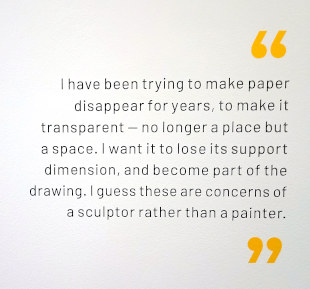
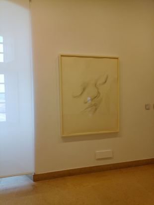
The artist makes the muse, Laura, triumph as the support medium disappears
He seeks to make boundaries invisible.
From Les Invisibles series
Whilst the Abba and Facebook founders are still calling shots the avatars may be not too bad, given their enthusiasm, but once the founders departed, Microsoft, Google and Amazon quickly became underperforming monopolies from the user point of view.
A neutral density personality filter bypass is offered to those prepared to accept it. From the literally colourful Google logo of the early years to the blandest of bland search results - just what any monopoly, absent entrepreneurs, would be happy to offer you. Even the Amazon Prime vans have had a reductio ad absurdum switch to grey, with boring logo and typefaces - the latter two having also discouraged people from Facebook for over a decade.
I have owned a business selling artists' materials. The only colour of paint we could not then offer (except looking very metallic)? Grey.
Gray's Elegy, popularised by Horace Walpole, has the advantage of not being grey. One supposes an elegy is about shades but not about the 50 that suit modern paint manufacturers. I have lived in a Georgian house and scraped through 200+ years of paints. No sign of grey paint so why overuse it in restoring Georgian houses?
I have even been secretary of a committee that wrote the British Standard for colours. The gripe then of people who understood colour a lot better than I? People preferred to use Pantone colours. At least they were colourful.
Well, maybe.
As for monopolies, the lack of human relations is not the way to go.