

A global archive of independent reviews of everything happening from the beginning of the millennium
![]()
![]()
![]()
![]()
![]()
![]()
![]()
![]()
![]()
![]()
![]()
![]()
![]()
![]()
![]()
![]()
![]()
![]()
Read our Copyright Notice click here
For publication dates click here
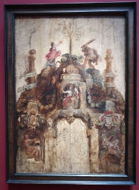
 Front and reverse of the Arch of the Mint, 1635,
KMSKA
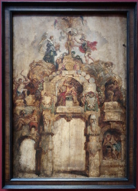
Front and reverse of the Arch of the Mint, 1635,
KMSKA
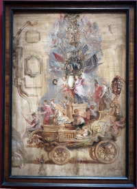 Triumphal Chariot of Kallo, 1638, KMSKA
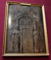 Title page design for Pompeo Introitus
Ferdinandi, 1638, Wallace Collection
Title page design for Pompeo Introitus
Ferdinandi, 1638, Wallace Collection
I must admit to be most fascinated by Rubens' designs for triumphal arches [1], book covers, book illustrations and even processional chariots.
The designs for the Mint were built as triumphal arches in wood for a Spanish prince who came as ruler of the Spanish Netherlands but, uninitiated, you might have said they were only an artist's flights of fancy.
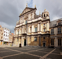 St Carolus Borromeuskerk, Antwerp
A
painter paints and draws on a flat surface as the default. Depth is
represented, not actual as in a sculpture, or built up only shallowly like the
thickness of paints. Rubens' most successful architectural elevation is at St
Carolus Borromeus but it is a facade only.
Here we are in the liminal
space where we want dreams to come true. The church looks glorious. You want it
to be glorious. It is glorious but entirely by a different hand, that of an
architect, and bears little relation to the facade. Even the tower seen
sprouting behind is not by him.
The facade is at the threshold
of emotion and reality.
ROYAL MUSEUM OF FINE ARTS ANTWERP - THE ART
Reviewed by ANDRE BEAUMONT
Epitaph of Nicolaas Rockox and his wife Adriana Perez
The museum, KMSKA, has been closed for renovations and building works for 12 years. Arriving 8 days after the grand opening my priorities were clear - see all the Rubens paintings and then see the fascinating architectural changes to the museum. Fortunately the latter meant spending time on the fourth floor in the new galleries displaying modern works with a strong weighting to Belgian artists.
So the review is necessarily selective and shows Rubens and a few of his contempories and a selection of modern works.
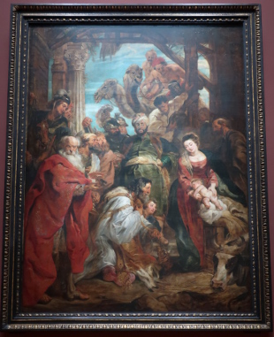
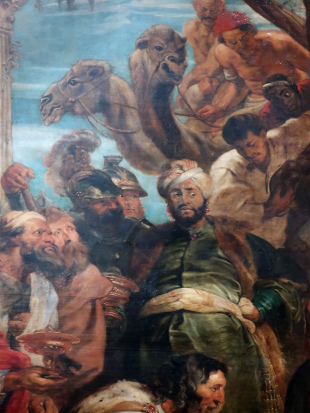
The Adoration of the Maji
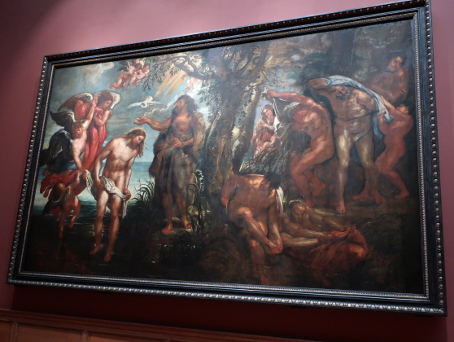
The Baptism of Christ
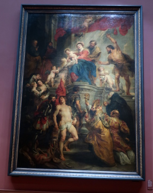
Enthroned Madonna Adored by Saints
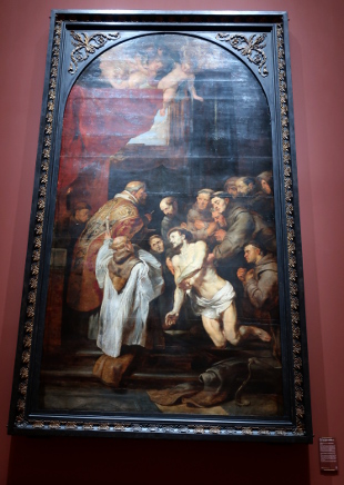
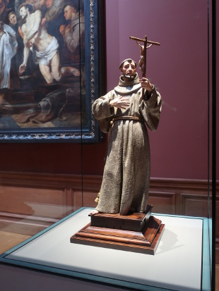
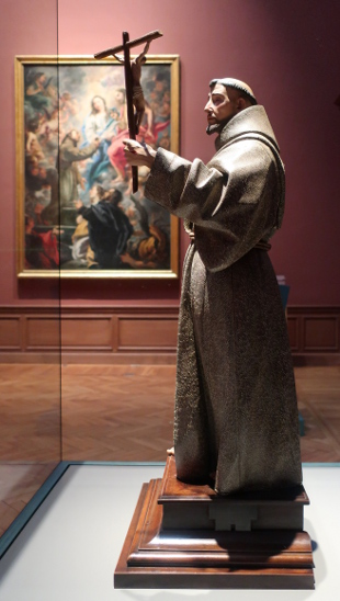
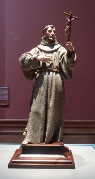
The Last Communion of St Francis of Assisi
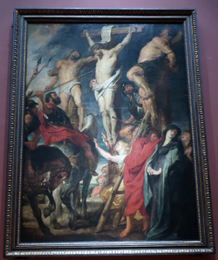
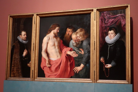
Anthony van Dyck, Christ on the Cross 'Le Coup de Lance'
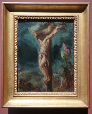
Delacroix, Christ on the Cross, 1846
One of the delights of the curation is that you get an occasional work displaced from where you would expect to find it (or might not even notice it) to another gallery where its significance gets noticed.
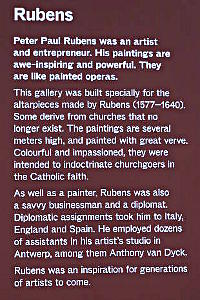
Delacroix admired Rubens and his Christ on the Cross appears influenced by the 'Coup de Lance' work above which he must have presumed was by him. After painting his Delacroix came back to Antwerp years later and went up a ladder to take measurements. Modern research demonstrates that 'Coup de Lance' is by Anthony van Dyke, assistant of Rubens. Rubens employed dozens of people in his studio over the years. The juxtaposition makes one stop and conclude that both paintings are very fine and worthy of the master.
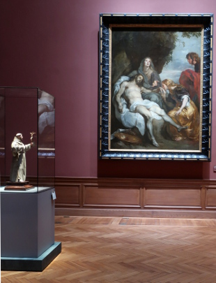
Pedro de Mena's St Francis of Assisi with Anthony van Dyke's Lamentation of Christ behind
After seeing the Pedro de Mena Mater Dolorosa that the Fitzwilliam Museum acquired a few years back I became an immediate enthusiast for this sculptor. The work is inevitably protectively encased, well-preserved and presumably restored but the detail, quality and emotional expression are so fine. It pays to get up close to look. The Murillo, being in the same gallery, makes a good juxtaposition as well.
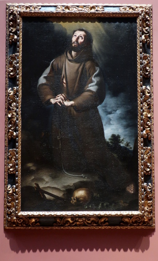
Bartolomé Esteban Murillo, St Francis of Assisi
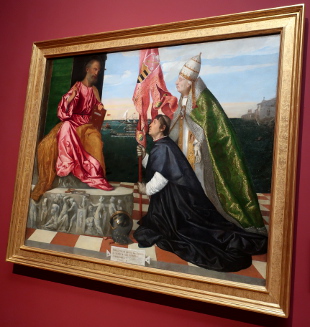
Titian, Pope Alexander VI Presenting Bishop Jacopo Pesaro to St Peter
Although you do have to live with the natural light or artificial light you can get, and both were pretty good in the restored neoclassical galleries at the museum, I do think that the use of greys in period building restoration displaying art and in museum galleries for walls is misplaced. The human eye distinguishes between shades of grey with difficulty and the mix of resulting colour casts and shadow that may result in grey rooms also inhibits the eye from seeing the non-monochrome colour that is there.
Many mobile phone sensors and camera sensors also convert near white to grey or beige casts - the same artwork photographed from two angles can appear alternatively with grey and beige casts - rather than the colours the viewer perceived [2]. You do get to wonder if the dominating use of greys and beiges in interior design is simply to get a blending photograph come what may.
I saw no use of grey internal decoration in the galleries I visited [3].
In both the paintings immediately above and below, the maroon background allows both the greys in the paintings and the palate of colours used to show. We also understand what is shadow clearly. The case for coloured walls is made. When you get to the white walls, ceilings and floors of the new galleries, the colour perception for the eye is excellent and any deficiencies become those of the sensors and their software.
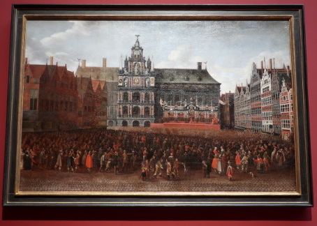
Maximiliaen Pauwels, The Proclamation of the Peace of Münster in the Grote Markt, Antwerp, 1649
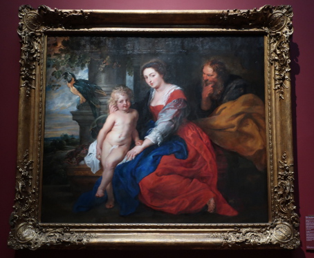
Peter Paul Rubens, The Holy Family and the Parrot
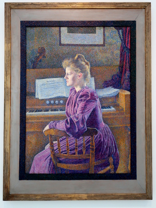
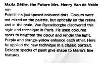
Theo van Rysselberghe, Maria Sèthe, the Future Mrs Henry Van de Velde, 1891
Moving from the first floor galeries to the fourth floor, colour accuracy becomes important for this pointilliste work.
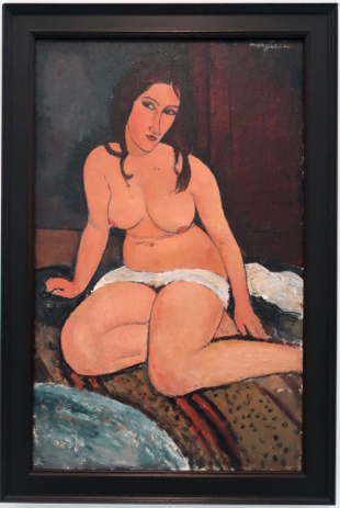
Amedeo Modigliani, Seated Nude, 1917
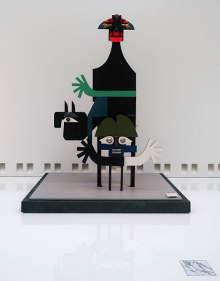
Pierre Caille, Roi Narquois, 1967
Rik Wouters, Contemplation, 1911
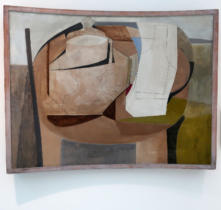
Ben Nicholson, Still Life (Curved Oval), 1950
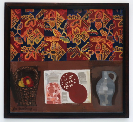
Jean Brusselmans, Still Life, 1936
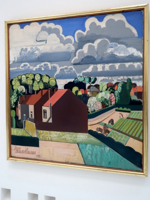
Jean Brusselmans, Spring, 1935
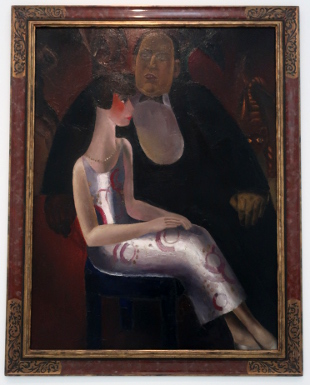
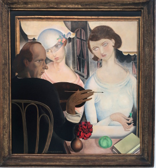
Frits Van den Berghe, Paul-Gustave Hecke and His Wife Norine De Schijver, 1923
Gustave Van De Woestyne, The Liqueur Drinkers, 1922
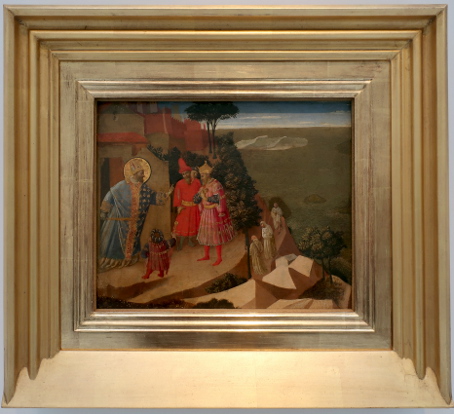
Fra Angelico, St Romuald Refuses Emperor Otto III Admission to the Church, 1435
So here again is a wonderfully displaced work. Yes it does look forward nearly 500 years (and it would not make a bad counterpoint to the Titian either).
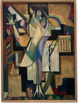
Paul Joostens, Sibyl, 1920